2022 Color Of The Year: Design Implications & Integrations
This post may include affiliate links in which we earn a commission, as we are supported by our users. All opinions expressed are always our own and any commissions earned are of no cost to you.
At the start of each year, color giants around the world publish which color they have researched and selected to embody the design color trends for that upcoming year. Designers scurry to see what has been forecasted, so that they can be up on the latest and greatest when designing for their clients. While trends come and go, the “color of the year” can tell us more about life, global well-being, and culture than many people realize. Likewise, changing up a space with a fresh coat of paint or new accessory to reflect the feelings and tones of the “color of the year” can be a simple way to positively alter the environment in which you will spend your upcoming days and months.
Design Implications
Color trends within design have been seen to be cyclical as we know that design history tends to repeat itself. Nestled within that truth, however, are the inner reflections of a culture at large. For example, the pastel colors, exemplified within the Rococo period of the 1730’s, demonstrated the desire for youthful gaiety and a fanciful, sensuous life (Rococo). While many of the same themes can still be seen in our own culture (think the millennial pink craze from a couple of years ago), looking toward this year, a slightly different tone of colors, showcasing fresh new beginnings and a connection to both nature and technology, have emerged.
Green
As many designers have forecasted, and now been confirmed by both Sherwin Williams and Benjamin Moore’s color of the year, green is set to become the new blue. With Evergreen Fog (SW9130) and October Mist (BM1495) being announced the “colors of the year 2022”, you can see the underlying draw to colors that exude meditative harmony, relaxing nature, and a fresh start. After two years filled with much confusion, distress, and polarization within the world at large, these quiet expressive colors seem to reflect the inner longings for fresh stability. Since more people have been encouraged to explore the outdoors (our national parks have seen record numbers!), it makes perfect sense to bring those same colors and soothing tones into our homes. With an added focus on the integrations of nature, design will continue to highlight not only the deeper soothing green and brown tones, but also tactile textures, sculptural forms, and vintage finds.
Periwinkle
Taking the idea of new beginnings in a different direction, Pantone announced Very Peri (Pantone 17-3938) as its color of the year. A creative and youthful color, Very Peri was created to encourage the spirit as people emerge from “an intense period of isolation” (Pantone), while also reflecting the rise of the digital world and its fusion within modern life. It seems the colors of 2022 showcase a dichotomy not only within themselves, but also in our world between connection to physical nature and digital space. Despite the opposite poles that they pull towards, both the green and periwinkle colors chosen reflect the desires for new visions of growth and transformation which I believe each of us can hope for and relate to for these upcoming months. Within the design forecast, technology will continue to become integrated into every aspect of the home including furniture, lighting, appliances, and mechanical systems.


Design Integrations
I believe when people first think of integrating the “color of the year” into their home, they imagine paint cans, brushes, and blue tape. But integrating a colorful design trend does not have to come in the form of painting your walls. Instead, I have found a collection of accessories, furniture pieces, and décor items that can be an easy way to integrate these fresh colors.
Benjamin Moore October Mist

$26

$1,698

Coyuchi Loreto Organic Dec Pillow Cover
$58

$44

$45

$55.50

$199

$39

$270
Sherwin Williams Evergreen Fog

$1,298

$78

$129

$130

$49.50

$258

$20

$44

$45.75
Pantone Veri Peri

$348

$30

$32

$199

$1,198

$28

$22

$89

$99
Want To Combine All Three?

$128

$1,098

$68

$45
Final Thoughts
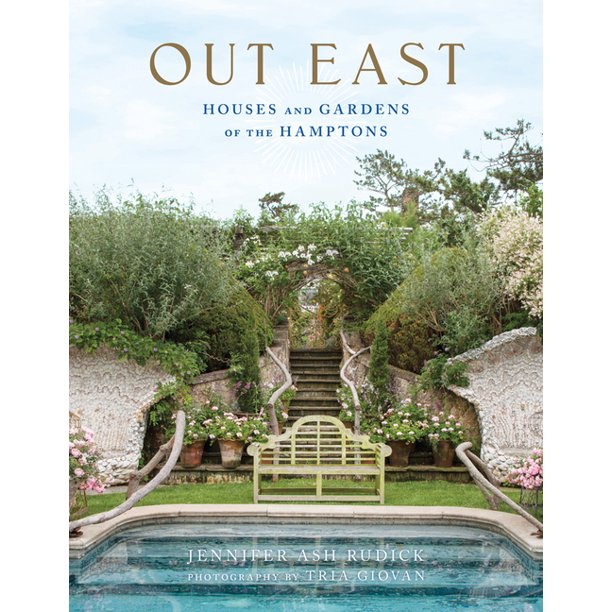
Implementing the colors of the year into your home can be as easy as a coffee table book, or as intensive as painting your walls. Either way, perhaps changing up your space is the perfect way to start your new beginning this year. Do you have another way you hope to incorporate these colors? If so, I’d love to know your thoughts and ideas, so let me know in the comments below!
Happy coloring!
Chloe
Articles
Pantone. “Pantone Color of the Year 2022 / Introduction.” Pantone, https://www.pantone.com/color-of-the-year-2022. Accessed 10 Jan. 2022.
Rococo | Definition, Art, Painting, & Characteristics | Britannica. https://www.britannica.com/art/Rococo. Accessed 10 Jan. 2022.


